Coming up with a book cover that will grab your potential audience’s attention is not an easy task. But I really enjoyed the process for my upcoming book, The Transformational Coach: free your thinking and break through to coaching mastery.
I’m working with a publisher called Right Book Press and they have the most phenomenal designers in their fold (not to mention project managers, editors, copy-editors, type-setters, and proof-readers).
For my last book, Mentor Coaching: A Practical Guide, I wanted a picture of a sunbeam breaking through the forest canopy. Why? Because I nicknamed myself Sunbeam about 15 years ago, as I was working out who I wanted to be to and for the world. It was also in the title of my previously self-published book Being a Sunbeam. Sunbeams are important to me and are a part of my current brand

Why a sunbeam?
Warming, nurturing, growth-encouraging. And I had a particular memory from school of choosing a picture of a sunbeam shining through the clouds to represent my idea of heaven.
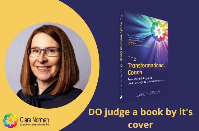
You might not have realised that my brand is meant to be the colours of a sunbeam in a stained glass window.
So I wondered with the publisher whether it might be possible to continue the sunbeam theme, but this time using the combination of my brand and sunbeams streaming through the stained glass window.
I sent some stock photo suggestions of stained glass that I thought might work. But it was hard to find stained glass window pictures that weren’t religious.
Design over photos
The publisher told me that photos are not as authoritative as a design, so out went the photo idea (I wish I had known that for my first book, but no one at my previous publisher gave me that advice). In retrospect, I can see it now.
Paul asked me to send across my brand images to see what the designer could come up with from those.
I also told him my favourite colour was orange and I would love the cover to be orange, also to match my last book.
I fell in love with what the designer had created. From the first batch of options, it was a no-brainer which one stood out the most.
We had a couple of iterations on the text formatting but I loved the way the designer had brought the stained glass and the sunbeams together.
After some more iterating, I had an orange version and the current blue version to choose between. Oh, how I was torn. I really, really wanted to go with the orange one for consistency. But the stained glass and sunbeams looked so much better against the blue background. The blue also looked so much classier! I hope you agree.

So that’s the story of my book cover. I hope it is screaming out to you, “buy me, buy me, read me, read me”.
But the proof of the pudding is in the eating as they say. And the proof of a book is in the contents inside of it. So I hope that the ideas within it will transform your coaching as they have mine.

